When Amazon announced the Kindle Voyage, it filled me with hope. Lighter? Yes please. Higher resolution? Why not? Magnesium case? Sounds great. Page-turning buttons? Huzzah! Amazon cares about Kindle again! Instant pre-order.
But when the Kindle Voyage arrived, hope turned to despair. Not just for the future of Kindle, but for the future of Amazon itself.
What Readers Want
A promotional image for the Voyage reads: “passionately crafted for readers”.

Imagine a restaurant that advertised its meals as: “passionately crafted for foodies” but a visit reveals sticky tables, dirty plates and a smoking chef.
This is the Restaurant de Kindle and I’ve been eating there for years. Hoping – against all evidence to the contrary – that the sign represents the food.
But actions, repeated over years, speak louder than words. Everything Amazon does shows they don’t care about the details and pleasures of the reading experience. There is no evidence to believe they will.
Typesetting
I’ve already written much and spoken much about typography on the Kindle. Please allow me to continue for just a little bit longer on this final Kindle review.
Kindle, from its inception uses ‘full justification’: changing the width of the spaces between words to force every line to span the screen. This doesn’t give you more words on the page, just the same words spread unevenly across every line. The effect makes ugly ‘rivers’ of space on the page and, for some readers, has the effect of speeding up and slowing down the narrator in your head.

The effect is bad enough on the physical kindle but is magnified on narrower screens, such as on the Kindle app. Add in Amazon’s inability to understand em dashes and the result is comically, insultingly bad for a product with the sole purpose of displaying text.

There are two options to improve readability: either break the words with hyphens at their syllables (as paper books and open source typesetting programs do) or simply don’t spread the words out (left justification) as is the case with this review.
Amazon Kindle gives you neither option to fix the justification. Search The Internet and you’ll find hundreds and hundreds of people asking, begging for Amazon to change this. Users go to great lengths to manually left justify their books which turns each Amazon ebook purchase into a multi-step-DRM-cracking trial of customer loyalty.
“Passionately crafted for readers.”
Let’s take a brief look at something that would be deserving of the above label. Instapaper not only does justification right, but also includes dyslexie among its font choices to make reading easier for dyslexics.
That’s the kind of thing a product does when it cares about its users. Oh, and by the way, when Instapaper introduced dyslexie it was a one-man product not a billion dollar company.
Is such a font available on Kindle? No. Is there any reason to hope it might be? Since Amazon hasnt updated anything about their typography since 2009 I wouldn’t hold my breath.
It’s not about Dyslexie in particular, it’s about Amazon saying they love readers yet failing to make even the most simple, low-hanging-fruit changes to improve the reading experience.
Fixing text justification isn’t asking a restaurant to find a new chef, it’s asking for clean tables. Yet Restaurant de Kindle does it not.
Worse and Worse
Even when Amazon makes changes, you often wish they didn’t.
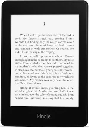
Here is the first Kindle I owned:

A perfect device? No, but it was pretty great (typographical issues aside). It felt weightless and had satisfying buttons on the sides to turn pages.
Then Amazon introduced the Kindle Paperwhite.
I was more optimistic about the paperwhite in my review but I found myself using it less and less over time. The touch screen made accidental page-turns more frequent and white light is the worst for reading in bed. It’s proven to keep you awake. A design team that cared would have made the light warmer.
Amazon also couldn’t manufacture screens that lit evenly. I exchanged mine many times before giving up settling on a screen that was good enough but also made every page slightly more irritating to read.
These irritations, combined with the increased weight, contributed to less and less frequent use of the paperwhite.
‘Button’
Rather than bring back the page-turn button for Kindle Voyage, Amazon birthed a Frankenstein's monster: This pressure sensitive white strip on the Kindle Voyage’s bezel.
This pressure sensitive ‘button’ is so bad, such an obvious worst-of-both-worlds construction its existence makes me doubt everything about the product team at Amazon.
To replicate the experience of the Kindle Voyage ‘button’ find an immovable surface in your house: a marble kitchen countertop will do. Place your thumb upon the surface, then press down – deforming your thumb.
Not pleasant, is it?
imagine repeating that gesture thousands and thousands of times over dozens and dozens of books for every turn of the page.
This is no button, it’s a repetitive strain injury machine. And a committee of humans (presumably including Bezos) somewhere in Amazon saw it, approved it, and shipped it.
Such judgement cannot be trusted.
If you want to avoid the RSI-‘button’ the Voyage does also have a touch-screen option like the Paperwhite. But this too has been made worse.
The touch screen, previously recessed, is now on the same level with the bezel which makes accidental pages turns more frequent. This flatness doesn’t make reading books any better – given the way the rest of the device is set up it makes it worse.
At Kindle design headquarters there should be a whiteboard with ‘Does this feature make reading better?’ at the top. Instead Amazon is trying to make the Kindle into an iPad-like tablet rather than making a speciality device “passionately crafted for readers”. The result feels like it fell out of an alternative universe where Palm survived into the tablet age.
Switching Costs
A recent two-week trip to America was intended to be a kindle testing ground but since Amazon does everything outside the US weeks or months late, my Kindle Voyage didn’t make it in time so I decided to try something else:
I used Apple’s iBooks for my reading on the trip. IBooks may not be the industry leader, but their product shows evidence of caring about the reading experience:
- There are multiple options for handling text justification.
- You can tap both margins to advance the page. (Unlike Amazon who thinks readers always hold their books in the same hand. Have they ever seen people read books?)
- There is an acceptable (though not great) dark mode.
- Collections of books sync in an understandable manner.
- You can make highlights in a book sample before you buy it.
Speaking of highlights: Amazon has no graceful option to update books. Updating a book, in Amazon’s world, is the digital equivalent of handing you a new book, then burning your old one. Hope you didn’t have any notes or highlights in there.
IBooks, meanwhile, can update books while keeping your notes and highlights intact. ::gasp::
You Can’t Convince Someone to Love You
Reading books is a large part of how I make a living. My decision to switch away from Amazon’s ebooks doesn’t come lightly.
I have a huge sunk cost in terms of my existing library of books in Amazon. The future costs will be large as well. I buy, and still plan to buy, my audiobooks from Audible – which often lets you get the Amazon version for a dollar extra. Now, many of the audiobooks I buy for work will have to be double purchased.
To be pushed over a switching-costs wall so high is serious business. This long-coming decision is helped by Amazon’s other blunders: Their Firephone is so terrible they literally can’t give it away and the existence of the Amazon Echo strains all reason.
(Seriously, I dare you to sit through the Echo Ad without skipping. While you watch that train wreck unfold before your eyes, keep in mind that somewhere at Amazon is a team of humans, led by Bezos, who approved it.)
These bizarre products, combined with making the kindle line worse two generations in a row, and a neglected software system for half a decade makes Amazon feel unstable. Mentally.
I had been planning to launch a big, public campaign about Kindle typography to try and get Amazon to change her ways. But I came to the conclusion: why bother?
A restaurant won’t get better no matter how much you care if the owners don’t.